
5 of the best templated football kits of all time
- Amos Murphy

- Apr 29, 2019
- 5 min read

Let’s face it, modern day templated kits are shit. Just one mention of ‘templated kits’ is enough to make your tapered-trouser, beanie-wearing, craft IPA drinking, immaculately bearded football hipster keel over and vomit all over their Clarks Wallabees.
But look hard enough and you’ll realise that some of history’s most famous ever strips have all come from templated designs. Amos Murphy has scrawled the archives and put together this list of 5 of the best templated football kits of all time.
5) West Germany Home, 1988-91
Originally released in 1988 but made famous at Italia ’90, West Germany’s tri-coloured ribbon design is one of the most loved kits of all time and is recognisable across the globe.
Stars like Jurgen Klinsmann, Lothar Matthaus and Rudi Voller donned the iconic jersey, as Die Mannschaft went onto to lift the World Cup trophy to a backdrop of Gazza’s tears, Lineker’s skid marks and Pavarotti’s Nessun Dorma.

However, what is less well known is teams like Ireland, Cork City and Boca Juniors also wore the three stripped ribbons.
Our favourite of the altered designs is the Boca Juniors version, which adopts their traditional blue and yellow colour scheme and creates a classic strip which has aged like a fine Argentinian red.

Italian sportswear manufacturer Ennere, even went onto shamelessly plagiarise the design for their early 90s Napoli away kit. Poor effort.

4) Bayern Munich Home, 1995-96
Another offering from the brand with the three stripes and it’s our first venture to the land of domestic football.
Bayern Munich have never, ever, ever had their kits supplied by anybody other than German sportswear giants Adidas - a partnership which stretches back for over 50 years.

And it was in the mid-90s when the two were at the height of their powers that Adidas offered up this red and blue stripped beauty. A shirt that you could probably wear at a dinner party and not look out of place in.

The Bavarians won their first and only UEFA Cup to date wearing this strip and it would find continued success just one year later in, erm… South London.
David Hopkin and Carlo Nash may have been a far cry from the likes of Oliver Kahn, Didi Hamaan and Mehmet Scholl, but one thing they did have in common was they all wore a version of this stunning collared design.

Crystal Palace exhibited an ever so slightly modified version of the Adidas strip when they won promotion to the Premier League by winning the First Division play-off final at Wembley in 1997.

The Eagles finished bottom the following campaign whilst wearing the same kit from the season prior, but at least they looked smart whilst doing so.
3) Nike Total T90 Kits, 2004-05
American super-brand Nike have been guilty for producing some of the most boring and lazy templated kits in recent memory, and some might think these efforts fall into that same category too.
However there’s just something about these strips which we can’t ignore.

Whether it’s the bizarre Euros of 2004 or destroying anybody who came near you with Henry and Bergkamp on FIFA 05, the simple but effective T90 designs open up a treasure chest of nostalgia whichever kit you look at.
From the sand covered samba beaches of Brazil, to designer shop boulevards of Paris, or the gritty industrial wastelands of Dortmund, there weren’t many places across the world you wouldn’t catch a glimpse of at least one variant of this shirt in the mid-00s.


But perhaps the most iconic part about this design was the shirt numbers on the front of the strip enclosed in a circle – an alteration on the Nike T90 emblem itself. It’s tasty stuff.
We have to say our personal favourite was the kit released for Portugal’s home European Championships in 2004 – the small chequered detail, coupled with the bold green shorts, donned by the likes of Figo and baby Ron make for a cracking combination.

Nike went onto release a one-off version of this shirt for an anti-racism campaign. The half-and-half black and white design was worn by a number of football’s biggest teams, but it doesn’t half remind us of next season’s Juventus kit. Don’t you think?

2) Denmark Home, 1986-88
Denmark would win the European Championships in 1992, in what was one of football’s biggest fairy-tale stories and one only to be rivalled by Leicester’s Premier League win two decades later.
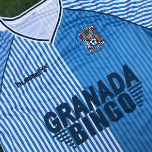
But it was for their 1986 home kit, supplied by fellow Danes Hummel, for which the world would first fall in love with them for.

A design which was originally released in 1984, it wasn’t until 1986 that the refined version was worn by the Red-Whites – a strip accentuating Hummel’s famous chevron logo.
Combining two of football kits’ most used tropes, pinstripes and half-and-half bodies, the strip worn by Jan Molby and the older Laudrup brother, Michael, just oozes class.

It’s a kit that probably shouldn’t work, but the subtle differences in the colour schemes perform wonders and such was the popularity surrounding this unique jersey, it found itself being used as the template for some of Europe’s biggest clubs.
In England Southampton, Coventry City and not long since crowned European Cup champions Aston Villa all sported variations of the shirt.


Whilst on the continent Sporting Lisbon, AC Pisa and Feyenoord Rotterdam all donned the pinstripe half-and-halves. Although the latter was somewhat ruined by the garish black and yellow Opel sponsor.


1) Netherlands Home, 1988
If ever a football kit has defined a generation, it is the Netherlands 1988 Adidas home shirt.

Worn by the likes of Ruud Gullit, Marco van Basten and Frank Rijkaard during the Oranje’s first and only major championship victory, the geometric patterned design, topped off with a suave V-neck collar is symbolic of the Netherland’s finest hour in football.
The Dutch beat the hosts West Germany (who were wearing their 1988 ribbon design strip) on their way to Euro ’88 victory – a match which resulted in Netherlands fans across the country taking to the streets and holding bicycles above their heads in celebration.

But the Germans avenged this defeat two years later as they went onto eclipse the Dutch’s greatest achievement, by winning the aforementioned 1990 World Cup, whilst wearing the same geometric Adidas template.
This time being used as an away kit for Die Manschaft, the green variation of this jersey was worn when Franz Beckenbauer’s men broke English heart’s and knocked the Three Lions out of the tournament on penalties.

Rather amusingly, this design was also shared by Germany’s Eastern brothers, who sported a blue version of the strip, and Arsenal wore a vaguely similar pattern during their golden years of the early 90’s.

But by far the best use of the geometric pattern belongs to the USSR: the red and white colour scheme might look like a lump of rotten flesh from a distance, but the typically late 80s feel to this design epitomises an at-the-time evolving Soviet Union – a nation looking to make a statement on the other side of the Eastern bloc.

We’re not quite sure whose bright idea it was to let rival volatile nations share the same kit design at the height of the Cold War, but whoever it was we’re glad they did, because the results are bloody beautiful.


Comments